New Sig

Eidolon

Guru
Joined
Feb 19, 2007
Messages
491
Location
Bristol, UK
Gil
0
New Sigz

Penelope_Cruz_by_Leon_GFX.jpg


Finally done. Been working on this one for ages. Jut couldn't get the right look.

Anyway what do you think?

*PS If anyone knows how to do accents on Photoshop that would be great. I want to get that accent above the "u" on her name.
 
Last edited:
the sig and effects are nice, but the part around her neck where u have put another of her back looks strange imo...delete that and keep the fade away effect on her shoulders and it would look cooler :)
 
the sig and effects are nice, but the part around her neck where u have put another of her back looks strange imo...delete that and keep the fade away effect on her shoulders and it would look cooler :)

Sorry I'm not sure I'm understanding you. Which bit of her back?
 
sorry bit tired lol...the left side of her neck has a duplicated copy of her...it makes it look odd :)

Penelope_Cruz_by_Leon_GFX.jpg


Better?

That wasn't a duplicated bit, it was just part of the stock that got a bit too distorted after a wave filter. Had to get rid of it using the Healing Brush tool.
 
nice work , but
The left side of her face has shades, which should be faced to the darker part of the BG . I mean the violet side.
Just flip the stock or BG or change the colors using filters.
 
nice work , but
The left side of her face has shades, which should be faced to the darker part of the BG . I mean the violet side.
Just flip the stock or BG or change the colors using filters.

Actually, the light source is just left of her face. I made the left side darker to contrast this. Otherwise one side would be dark and the other light, which I hate with real-life sigs.
 
Oh
If you dislike real styles , then I have nothing more to say .
 
No , I am not joking.
Its what I realized from your last post , or maybe I misunderstood it.
Anyway , I like the way you creat siggies.
Good luck on it.
 
No , I am not joking.
Its what I realized from your last post , or maybe I misunderstood it.
Anyway , I like the way you creat siggies.
Good luck on it.

Ok nevermind :P

Thanx for helping.

BTW Anyone know how to get accents?

I know I asked before, but it's really bugging me!!!

When I look at it I just think it looks weird without that accent on the u!!!
 
Last edited:
*Sorry for double post*

Decided that instead of making lots of new thread, I'll just post any new stuff in this thread.

Zhang_Ziyi_by_Leon_GFX.jpg


A new one done today.

Slightly stole the concept (b/w + bits of colour) from another sig :P Still, aside from that it's all my own work.

Something a teeny bit wrong with the lighting. It's too bright near her face for my liking so I'll change that in the near future.

Anyway, how's it so far?
 
Very nice in everything
But I feel ( just feel) Its too much saturated
Maybe if you decrease its saturation or use a very light Pink/Red color , it look better
 
Very nice in everything
But I feel ( just feel) Its too much saturated
Maybe if you decrease its saturation or use a very light Pink/Red color , it look better

Thanx for that, I did another version with, as you said, less saturation on the red. I would have uploaded it but DevArt was playing up for some reason.

Anyhow here's another new one:

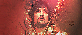
Kasabian__Sergio_Pizzorno_by_Leon_GFX.jpg


Sergio Pizzorno from the band Kasabian.

Larger canvas here, but effects and techniques are nothing new. Was just trying to see if I would like new canvas, and surprisingly I actually like it quite a lot.
 
Back
Top