Navigation
Install the app
How to install the app on iOS
Follow along with the video below to see how to install our site as a web app on your home screen.
Note: This feature may not be available in some browsers.
More options
You are using an out of date browser. It may not display this or other websites correctly.
You should upgrade or use an alternative browser.
You should upgrade or use an alternative browser.
Bleach tags
- Thread starter Morrigan
- Start date
- Tagged users None
Zayler
Curious
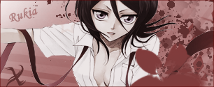
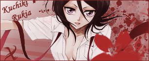
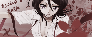
The 2nd version of the Rukia sig, because the colours bring it more to life and make it way more eye catching.
The 3rd version of the Yoruichi sig because the lighting works well that it focuses attention on the centre of the piece, while in the 1st it's too flat and in the 2nd the lighting effect was too small, which made it too dark around the edges.
Keep it up Sakura!
The 3rd version of the Yoruichi sig because the lighting works well that it focuses attention on the centre of the piece, while in the 1st it's too flat and in the 2nd the lighting effect was too small, which made it too dark around the edges.
Keep it up Sakura!


