Bei Bei's ai hao

Sorry idk but this sig is every where on google and on forums lol

http://forums.d2jsp.org/topic.php?t=31566150&f=111&o=10

you sure you made it?


RoyalFlush.png
 
Yeah, people like to steal my work. This was the first version that I did of the sig and didn't like

Poker.png


Changed it to end up with this
RoyalFlush.png


And then someone wanted it for their signature so I changed it yet again

Poker-2.png


That jerkoff obviously just stole it and added his username to it

If you look at my deviant art, I added it October 14, 2008
http://beibei-craze.deviantart.com/#/d1nzong
where he made his May 29, 2009
 
Last edited:
i dont mean to say you stole it or sumthing i was just curious cuz its an awsome sig,
and since i saw this pr*ck using it i was just wondering so i asked :p

but anyway nicely done, keep up the good work (Y)
 
Thank you. I always appreciate when people let me know when they see my work on other sites. It's funny but if they were to ask me if they could use my work and claim it on their own, I'd probably actually do it as long as I'm recognized some way.
 
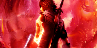
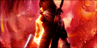
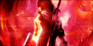
Well, I've been kind of stuck here. Been doing a couple of things in my spare time. Found this really great stock that I wanted to use so I decided to work with it. The further along I got with it, the more frustrated I got. I came up with these top 3 results. I made over 20 variations of this sig and these 3 came out the best. I'm not sure which one I think is better, I hate all 3 of them, but after doing over and over more than 20 times, I'm not working with it anymore, so here they are

Dragon1.png


Dragon-2.png


Dragon2.png

nice work on this one only i would lower the colour a bit its to red i think.
but rest looks fine good job.
 
Well, I've been kind of stuck here. Been doing a couple of things in my spare time. Found this really great stock that I wanted to use so I decided to work with it. The further along I got with it, the more frustrated I got. I came up with these top 3 results. I made over 20 variations of this sig and these 3 came out the best. I'm not sure which one I think is better, I hate all 3 of them, but after doing over and over more than 20 times, I'm not working with it anymore, so here they are

Dragon1.png


Dragon-2.png


Dragon2.png
I like the detail in the second one but the lighting in the third. The third one has good lighting, while the background of the second one shows up well and I like that.

The thing I like about the first one, though, is the look of the text.
 
Back
Top