Some of my creations

Da5nake

Blue Mage
Joined
Feb 20, 2007
Messages
130
Location
Miami, Fl 305
Gil
0
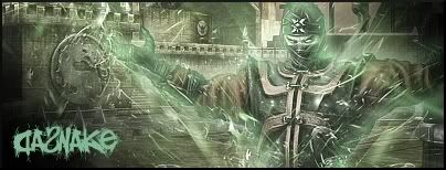
here are some mortal kombat characters that i made into a sig
DaSnake1.jpg

DaSnake2.jpg

DaSnake.jpg

(i dont like this one much)
Cyborg.jpg

this one was taken from a tut:
SigSnake.jpg
 
I like them all but.. I didn't think your text in the blue one with Sub-Zero blended very well into the peice and the cropping on that one was a little weird, too.
 
They are all quite nice.

#1 Don't particularly like how some of the background is blurry and some is sharp. Not sure if that's intentional or not.

#2 Cropping is bad, and render could be blended better. The background seems to be too intense (in term of colour).

#3 My favourite, but a little blurry around the render (maybe that's just the render...)

#4 Nice in general

I think they all look good, but very similar.

Out of interest what do you use to make your backgrounds?

Also, and this is my personal opinion, I don't like the canvas size.
 
#1-#4.....I don't know where to start to be honest they are quite the same really. Ok you used a different brush however they are kind of generic, you might want to stop just brushing randomly and stay away from brushed in backgrounds. They don't look too nice in my oppinion.

The outer-glow is kind of wierd but meh it works fine with the MK sigs.

#5. That is a good one, I can't see anything wrong with it.

Try using a smaller canvas if you don't have much ideas they look horrible if you just brush in a background.
 
#1-#4.....I don't know where to start to be honest they are quite the same really. Ok you used a different brush however they are kind of generic, you might want to stop just brushing randomly and stay away from brushed in backgrounds. They don't look too nice in my oppinion.

Yah I agree - the brushed backgrounds are just all too common IMO. Everyone does it, apart from people who don't like it (me, Light), and it's really simple.
 
They're not bad, I've definitely seen way worse, but I have to agree, they all look a little too similar. The brushed backgrounds with the solid color, it's just a little too common.

There's too much vacant space in the first five, and the blending needs work. Tbh, IMO (hahahahaha....abbreviations), the best one is the last one cause it's a little more original, and there's not as much 'emptiness'. I definitely see potential though, keep at it!
 
ya now that i look at it, these are my starter sigs i've moved on from using and combo using the same grunge BG. i will soon update the MK characters, except Rain of course. he was tutorial :D but the rest will be remade and reposted to compare :D

thanks for the CC guys really helpful on making my next sigs better :D
 
Back
Top