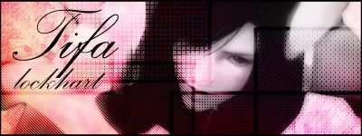
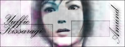
I like them, they're not bad. I favour the second one over the first. As Yuri said, the opacity of the squares needs to be brought down, they stick out too much. I would also advise to not have brushwork or anything like that covering your images so much, it's not a good look.
This site uses cookies to help personalise content, tailor your experience and to keep you logged in if you register.
By continuing to use this site, you are consenting to our use of cookies.