Britalia
.//O b s e s s i v e\\.
Okay, I've been working on a lot of GFX lately, but I'll only post the stuff I made today:
Garnet~


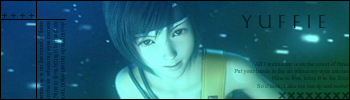
Yuffie~
Tifa~


PLEASE C&C!!!!! YOU PEOPLE IGNORED MY OTHER TOPIC!!!!
Garnet~
Yuffie~
Tifa~
PLEASE C&C!!!!! YOU PEOPLE IGNORED MY OTHER TOPIC!!!!