Navigation
Install the app
How to install the app on iOS
Follow along with the video below to see how to install our site as a web app on your home screen.
Note: This feature may not be available in some browsers.
More options
You are using an out of date browser. It may not display this or other websites correctly.
You should upgrade or use an alternative browser.
You should upgrade or use an alternative browser.
Piro's Sigs
- Thread starter Piro
- Start date
- Tagged users None
- Joined
- Jun 20, 2006
- Messages
- 2,517
- Age
- 32
- Location
- West New York, NJ
- Gil
- 3
- FFXIV
- Itami Raizou
- FFXIV Server
- Lamia
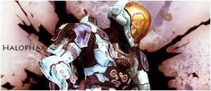
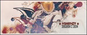
It's really good I kinda like it but I think there colors which can suit the render quite better.
I have nothing to say about this it's really well-blended

I'm gonna agree with Oerba on this one, it's kinda plain. :\


- Joined
- Jun 20, 2006
- Messages
- 2,517
- Age
- 32
- Location
- West New York, NJ
- Gil
- 3
- FFXIV
- Itami Raizou
- FFXIV Server
- Lamia
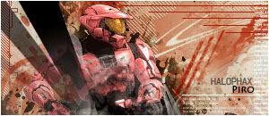
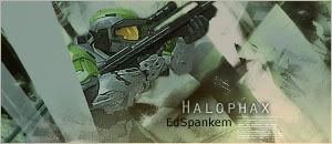
1st one the tag is kinda crowded and I don't think the colors fit the character's, also the text could have been done better.
2nd one well it's too dark maybe you should lighten it up, the text also could have been done better, you know you don't have to place a text in there, right? xD
3rd one I like it although I think you do quite a better job in blending the focal point with background and I don't like those white lines it looks like it's ruining it.
another update:

Omg this one is amazing. I just love the effects you have in the background! I must say these are some of the best i've seen on the forums so far.
All your sigs and Avvys are just breathtaking! Please, keep them coming, i can't wait too see more of your great work! Just can't get over the backgrounds, and the renders you pick work perfectly with the sig.
That Chocobo one is so adorable!
I like how the yellow background blends so nicely into the Chocobo it self.
~Tifa~
I like how the yellow background blends so nicely into the Chocobo it self.
~Tifa~
- Joined
- Jun 20, 2006
- Messages
- 2,517
- Age
- 32
- Location
- West New York, NJ
- Gil
- 3
- FFXIV
- Itami Raizou
- FFXIV Server
- Lamia
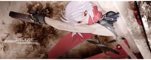
I'm not sure about the last ones, they seem kinda crowded try cutting out a few of those effects. =\ especially the fourth and the fifth, I find the third one kinda good really, 1st one not sure about the green color, 2nd one not blended in. >.> otherwise you're pretty good I must say.


I really like your sigs a lot. ")
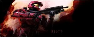
the riott is my favourite out of the new ones you have posted up, i love the brushing and the dark space to the right. The fantasy one on the post above is great aswell, i love the colours theyre very eye catching and the whole placement of the sig is brilliant
the riott is my favourite out of the new ones you have posted up, i love the brushing and the dark space to the right. The fantasy one on the post above is great aswell, i love the colours theyre very eye catching and the whole placement of the sig is brilliant
FallenAngel
Free-falling
This recent one i ADORE
I think the colors you used and the text looks good with it 
Your work is phenomenal! Keep up the work hun

- Joined
- Jun 20, 2006
- Messages
- 2,517
- Age
- 32
- Location
- West New York, NJ
- Gil
- 3
- FFXIV
- Itami Raizou
- FFXIV Server
- Lamia
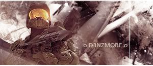
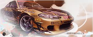
Oh those are pretty good tags, except for the first 2 tbh >__> my favorite would be the BMW car tag it looks really cool and it's blended in well with the background, the last one is pretty good, too.
You have a good style, though you and Lew are pretty much have the same style IMO >__> good work.
You have a good style, though you and Lew are pretty much have the same style IMO >__> good work.
Your texts are amazing. Really. Good eye for that.
This is my favorite out of your most recent. I don't have any comments about it. It's so...finished. Good job!
New sigs guys! Comments!

This is my favorite out of your most recent. I don't have any comments about it. It's so...finished. Good job!

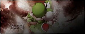
Theyr cool, i like the simplicty to them. I especially like what youve done with the red in the yoshi tag. Im not usually fond of smaller sigs but u seem to make them look like they should always be that size. Awesome work again piro.
What I like about your recent tags is the fact they are simple, clean but also really appealing. Your choice of text always seems to match the mood of the focal and sometimes it's hard to do that. I love Yoshi and that tag is just so adorable :mark:
I'd like to see a lot more work from you. =3
There's not much else I can say except, keep it up.
I'd like to see a lot more work from you. =3
There's not much else I can say except, keep it up.
I have to concur with the above posts, the simplicity of them really makes them stand out, and from experience making simple sigs that are effective is a lot harder than what it looks and you've nailed it boyo!
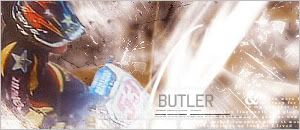
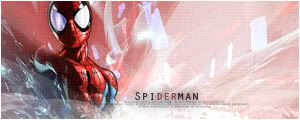
The light colour scheme is great as it brings it together but it doesn't attract the attention away from the render, the effects are little but are used really effectively, the lighting is fantastic and the font is spot on, particularly in the Spiderman sig.
Great work, looking forward to seeing more!