Navigation
Install the app
How to install the app on iOS
Follow along with the video below to see how to install our site as a web app on your home screen.
Note: This feature may not be available in some browsers.
More options
You are using an out of date browser. It may not display this or other websites correctly.
You should upgrade or use an alternative browser.
You should upgrade or use an alternative browser.
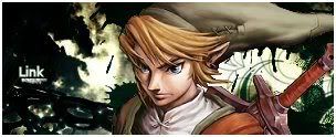
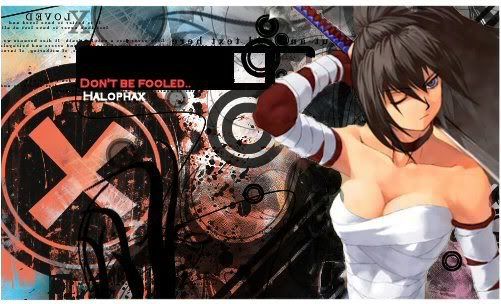
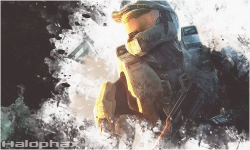
Piro's Sigs
- Thread starter Piro
- Start date
- Tagged users None


GFX Guilder
TI Vice-Captain
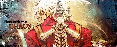
alot of these are pretty legit IMO...
The text needs to be taken off in a few of them such as the first two for starters
The text needs to be taken off in a few of them such as the first two for starters
GFX Guilder
TI Vice-Captain
Sorry, what does IMO stand for? and thanks, i'll keep that in mind.")
im sorry thats a habit of mine. It means In My Opinion
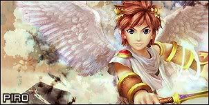
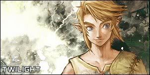
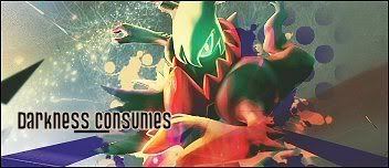
Pretty good work, these are my personal favourites:
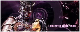
I really like that thing on the left side with the boxes. It livens up the text and goes with the Advent Children theme.

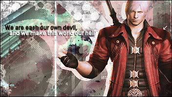
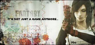
I like how the right side of the Sig all seems to flow together.
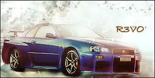
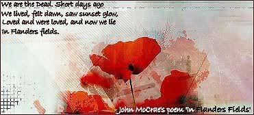
The background goes very well with the render, I must say that the text looks a little out of place though.
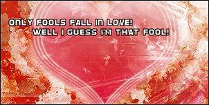
You have produced some pretty cool stuff. I'd suggest you try experimenting with some more vibrant, less pale colours though.
I really like that thing on the left side with the boxes. It livens up the text and goes with the Advent Children theme.
I like how the right side of the Sig all seems to flow together.
The background goes very well with the render, I must say that the text looks a little out of place though.
You have produced some pretty cool stuff. I'd suggest you try experimenting with some more vibrant, less pale colours though.
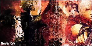
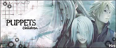
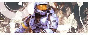
My favorite out of the bunch. Choice of colors were great. Not too crazy about the text, but the little details around it were good. I can see you use a different style.
I like it. XDKeep it up. I'd love to see more.


GFX Guilder
TI Vice-Captain
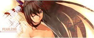
I love your tags
The only thing i see wrong is that they all look way too sharp
The only thing i see wrong is that they all look way too sharp


GFX Guilder
TI Vice-Captain
oh well try blurring them a little bitI didn't sharpen them though. :/


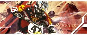
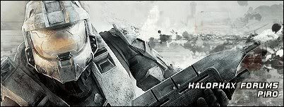
Your work is awesome man. That travis pastrana sig looks so good. The larger graphics look brilliant aswell, a lotta people struggle when they move onto a bigger canvas but it looks like you have no problems at all with it. I especially like the middle one, the background is cool as. I love graffiti/messy backgrounds and yours is perfect.