Ke$ha's Party

Ayumi Hamasaki

It's a beautiful dream, but a dream is earned
Veteran
Joined
Sep 25, 2009
Messages
1,667
Location
Kentucky
Gil
16
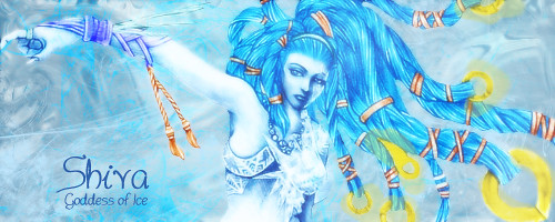
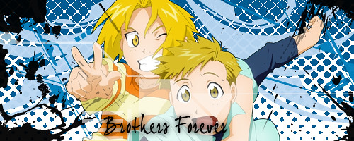
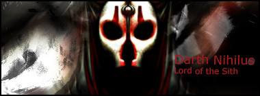
This are my first signatures. I haven't made that many total and these are the best of what I got. Any kind of compliment or constructive criticism is more than welcome. :D I'll upload new ones as I make them. Right now these are what I've got:

5392533227_f7db015e2b.jpg


5393131314_71161982c4.jpg


5393131284_a091159664.jpg


And two avis:

5392533197_3830423b42_s.jpg


5392565687_d71bb56d09_s.jpg


Tell me what you think::highfive:
 
Last edited:
Promise me you won't do this again and I'll give you a good critique.

I'm joking. Kinda. The other works from you, I think are pretty good. Are you making sure to use layers/transparency when possible and also using smudge?
 
I'm joking. Kinda. The other works from you, I think are pretty good. Are you making sure to use layers/transparency when possible and also using smudge?

I'm pretty sure I am. Layers at least. Transparency I'm not entirely sure about, because I just started back using Photoshop again this morning and I'm using difference version then I did last time. CS5. :D

The Ke$ha one is a reference to the whole Glitter thing. But it isn't exactly what I wanted it to look like. :D

Thanks. I want to get good at this, so any thing like this is helpful.
 
http://www.flickr.com/photos/58797930@N05/5397255000/


http://www.flickr.com/photos/58797930@N05/5396656899/

I'm loving the Chaos one, the colours of the background go very well with the renders you are using, I'm also liking the effects your using in the sig :) good work


again i'm loving the background you used in the sig but the render not really blended into the background on this one :) maybe playing with the blending optons or using something like a eraser turnt down to 30% or a smuge effect to blend the render in a bit more :)
 
Your chaos sig is one of your best works because it has the text in the right place and it's focal point clearly visible. SO successful. I think the Nikki sig could have been better by making it smaller and possibly adding text. Don't be afraid to add borders using the marquee tool. It can work wonders for a sig :P

The kesha sig would have been nicer if it were a tad smaller and if she had more color. Try duplicating her layers, setting them to soft light or something like it and play around with the opacity. I think you're a pretty decent GFX artist though ^^
 
The best advice i could give would be to go read tutorials. You dont have to follow them step by step, but attempting them or even just reading through them will increase your skill by loads. You need to learn what photoshop can do. The more options you have available to work with the better and more in depth your sigs will be.Adding brushes and text is the basic of basics. Photoshop can do many things.
 
So missing around trying to relearn things and blah. :wacky:

Here's my sig that I worked on today. It's not perfect, I don't think the text exactly works, but I don't think it's horrible either. And for the most part it looks natural which is what I was aiming for. Also I wanted it to be dreamy a bit too. Anyway, past my excuses for it, here it is:

5632450542_b568d454c2.jpg


5631866907_c31c357bdb_t.jpg
 
I think I did an amazing job on this one. Except for the text. I really really like this one. I'm excited. It's not perfect, but it looks really nice to me. :yay:

5632784960_f6a39f3688.jpg
 
5633192898_2052140e43.jpg


Probably last one of the day, but I had to share.

Yet again Text problems. I think I handle this one better the text on the other ones though.
 
Cody... you are really starting to get there... your latest work is really good... the set you made which you are currently using this one...

5632450542_b568d454c2.jpg


it amazing the guy is blended in really well XD and the effect you are using on the text is very good XD

one thing that you need to do borders... it rounds off a sig very well XD just look it up on google an ur get the hand on how to make one XD apart from that great work cody and I hope i see more from you :D
 
New Sig, last one of the day probably. It's good. I like it alot. Simplistic but it works. And blue's my favorite color so yeah I like it.

5636710544_97abe2b082.jpg
 
Hello there.

Your first signatures were pretty cool, the only problem I could see with them was the text that was too simple/oddly coloured compared to the rest of the signature. But you've improved a great lot. I really like the "The Ready Set" and "Madonna" signatures. The Shiva one is pretty good too.

Keep up the good work! :D
 
So I was messing around last week with a SOTW entry, that I never got around to submitting, because I couldn't quite perfect it. Instead of just throwing it away, thought I'd post it here. :yay:

5676311980_4b6bd98ebe.jpg
 
This is the first time I've really messed around with a lot of color. I think it's a favorable result. Not perfect by any means, but it's nice to look at in my opinion.

5677770749_1cfc70d892.jpg
 
And it's been a semi-productive day today, so here's my first black and white. It's not my best work, but I was trying to go with the theme of the song/poem. I wanted the sea to splatter, and I think the tag is decent. Anyway here it is:

5678418462_309722ee45.jpg
 
Back
Top