Ke$ha's Party

And it's time for another first. :yay:

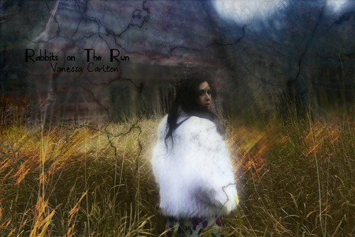
My first large scale piece. I was convinced that I'd probably never do one, but then I saw this perfect scene that i had to play with and make more visual. I think it's too bad, and it looks really natural which is one of the things I aim for. I like understated effects that enhance the picture whether than the glaring obvious effects.

5678526132_965814ba18.jpg
 
So I was bored, and messing around and I made this concept piece. It doesn't exactly work, but it's supposed to represent the meaning of the song more than anything. It made sense to me when I was working on it, but looking at it now it's iffy.

5678377507_2be8716686.jpg
 
So another piece today, I don't think it quite turned out the way I wanted it to, but meh, it's good enough.

5681308016_6eed255428.jpg


I'm trying to make a decent Stevie Sig, but I think I've still got some work to go. Finding decent photos of her is sometimes complex though. Anyway I shall keep trying until I'm satisfied with it.
 
So I did another large scale piece. I think it's okay:

5681693284_6eece8942d.jpg


I really like the Vanessa one better though.
 
Some of your ideas are great but I think you should find a way to blend things in more. In the Rabbits on the Run one Vanessa, or whoever that girl is, is wearing a coat that's just way too obviously edited/smudged. I suggest lowering the opacity. For the gaga sig, the girl looking too blurry kind of hurt my eyes. A clearer image would have been better with maybe some color manipulation? The last two are alright but the second to last seems kind of plain and uninteresting. I think some gradients set to a low opacity in soft light layer settings would work wonders for it. I think you should also work on your text placement. A lot of it just seems thrown onto the sigs last minute. Now I'm pretty bad at text placement myself but the goal of text is to make it look like it belongs in the sig or is a part of it. Having it awkwardly placed on the side is kind of uninteresting so maybe give your text different fonts, sizes, etc and find different placements to make it seem dynamic ^^

Keep the work up! ^_^ There's nothing but improvement for all of us so keep experimenting and making things. ^^
 
At first looking at your sigs, I like what you have going, with the backgrounds and the colours, however sometimes your text can seem a little too bold, dying down the opacity of the text, even a little, will make it blend in with the tags better.

And I know you haven't put it up yet but that request you did recently is awesome. It's a big step up from your other ones, keep it up!
 
So it's been a massive amount of time since I picked up Photoshop yet again, but I'm trying to get back into (yet again :wacky:).

So I was doing tutorials to refresh (and learn :wacky:)

And this is what I've come up with so far. I'll edit in more if I make anyway. :wacky: until someone responds. :yay:

6307466671_0a11177760.jpg
 

Great work here! I like the blending and colors. Lighting works well. Only that it could have been better if it's a bigger sig.

I browsed through the previous pages, and I agree with some of the comments here about your text. I used to have such problem with texts. Choosing the right text can be such a fuss and frustration. Well what I did was to play around with layer blending options. Give the text some outer glow and gradients. Using multiple fonts always work for me too. Text placement is also very important. Your newest sig has a corner text, but I think it will look better if you bring it up to the middle left. i.e. fill up the empty space there. I used to like putting corner texts too, and found that it's not the way to go for me. Download some fancy fonts over the Internet. The default ones are not the best.

Experiment with layer types, like soft light, color burn, etc if you havent. Like Oli said, try putting a gradient over the image and apply soft light. It will look amazing. Sorry if you know this already :P

I think you have lots of potential to make great sigs. It takes practice to get better. Good luck.

Yeah fonts are always my most major problem. I find that I can really neat looking stuff, but the font comes along and ruins it all. :wacky: I have got a lot of new fonts to mess around with recently, and I think that I've just got to mess around with them and figure out how to match them to the picture.

6310131272_75a64f367e.jpg


So this another new one that I made, but the font is still shit. :wacky:
 

Te lighting and image are awesome actually. Did you try applying gradients with soft light? I wish it was bigger so that you can squeeze in more effects and colors. The position of the text itself is alright. It's just the font use now, as you said. Experiment with different fonts, colors and multiple fonts in one sig, and you should be better in no time.
 
Thanks for all the comments and criticism guys. :yay:

So I wanted to miss around a bit with the concept of colors and stuff, and I think my result was pretty good, considering the original picture is in black and white. It looks cool, the text is sort of negotiable, I couldn't really think of what to put, but I do think the font works pretty well, at least better than most of mine. I'm not sure if I like it with the boarder, but it does make it look cleaner.

6320491419_47260b3ede.jpg
 
Back
Top