


Great siggys I say!!! The wingman one is creative I love the text on that one. But Your Yoshi one is very creative I just love how you did it. Yoshi is probably my favorite siggy from you.
Navigation
Install the app
How to install the app on iOS
Follow along with the video below to see how to install our site as a web app on your home screen.
Note: This feature may not be available in some browsers.
More options
You are using an out of date browser. It may not display this or other websites correctly.
You should upgrade or use an alternative browser.
You should upgrade or use an alternative browser.
Piro's Sigs
- Thread starter Piro
- Start date
- Tagged users None

It's been a while since I've seen a really good black and white signature. Great lighting and the rugged effects work. As always, text is well placed and font is well chosen. Awesome piece.
I'd love to see more of your work. Keep it up!
Wow I can't believe it took a while until I stopped by your thread!
You're really really good at what you do I must say.
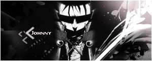
The JTHM one is awesome! I used to love that guy. XD
The black and white theme is suitable and I love the text and placement of it as well! Those little arrows coming off of it look awesome!
He's blended in really well and the background is very well done!
The Dante one is also freakin' sweet!
I like the grid texture on the left hand side and the smoother section as it goes to the right.
The lighting on his hand is perfect! The lighting overall is fantastic actually.
Love the text and the font is great! I love how you coloured the 'D' red and the rest of the name in black. I also like the subtle use of paint splatter brushes too!
Well done here! I'd love to see more of your work!

I rather like this one. I love the texture of the background very much! Very creative!
The image is blended in well and the colours all match wonderfully!
I love the size of your signatures too! Very cute!
The text font is gorgeous and I like how you chose two different colours for each word.
Wonderful blending, lighting and I like the smudginess of the background too!
Awesome work on this one!
I love the effects on the left and right hand side! Very unique!
The colours are great and the image is clean and crisp!
Love that white strip down the middle wit the text in it too. It looks awesome! It totally stands out and doesn't take the focus away from the dude at all.
Brilliance once again!
Keep it up!

- Joined
- Jun 20, 2006
- Messages
- 2,517
- Age
- 34
- Location
- West New York, NJ
- Gil
- 3
- FFXIV
- Itami Raizou
- FFXIV Server
- Lamia
This is one really magnificent black and white sig. It's really fucking cool. The text placement is really but I don't believe the font is well, and I think you should have blurred the text edges <.< otherwise it's magnificent.

I have that render, I have been planning on making a sig using it but I just don't the time to do so. ;( I like the splashes it goes well with the render, However, I'm not sure about the colors, anyway it's a nice piece.

I like this one, well I like the colors. Very good sig, Piro. Keep it up. =3
I really like this one!
The lighting is magnificent and the colours are gorgeous!
I love the image of that guy too! It works perfectly with this tag.
The little drops of paint falling down look splendid and the text is wonderful! I love those little arrows underneath the text as well.
Awesome work!
Very simple one this tag.
I like the colour scheme and the image is cute. The only thing I don't like is that I think that the image kinda looks like it's hanging there.
The text is awesome once again!!!
Awww so sweet!
The colours work well with the image. The background is peaceful looking and the soft blurry feel of it is great!
I love the text and the font is awesome! The little text underneath looks great as well.
The only thing I thought looked a bit out was the position of the text. It looked a bit too far away from the girl in my opinion.
Other than that, gorgeous work once again Piro! Keep it up!


I quite like the abstractness of this one. The cut out playstation controller looks cool and the random bots of stainless glass blended in with the red brushes look awesome!
Love the text and how it goes with the flow of the image. Cute border as well.
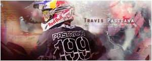
This one I feel is just a tad too dark. I like the deep and serious feeling I get from it. The lighting in the sky looks nice and I like that little fuzzy cloud around the text!
I quite like this one!
Tidus is blended in really well and I love the splats of yellow behind him.
The spattered ripple effect on the left I think didn't really suit the softness that's on the right though.
Text is gorgeous and I like the font used.
Keep up the awesome work!
I just love the Yoshi one lol. Your latest pieces are excellent, you can create different sorts of signatures, not just 1 techniuque. Keep up the good work!
Thanks for the comments guys ") Always appreciated.
Always appreciated.
Here is a few more I did.
I know they are Halo, only because they were special requests
http://img36.imageshack.us/img36/7853/tehermine2.jpg
http://img37.imageshack.us/img37/7501/trueo.jpg
Always appreciated. Here is a few more I did.
I know they are Halo, only because they were special requests
http://img36.imageshack.us/img36/7853/tehermine2.jpg
http://img37.imageshack.us/img37/7501/trueo.jpg
Last edited:
Love both of your recent ones!
The lighting and blending is superb in both of them! The colours flow wonderfully together and the backgrounds look awesome!
I love the text. Very simple, but effective!
I noticed they're different to the usual size you use as well. =)
Keep up the awesome work!
The lighting and blending is superb in both of them! The colours flow wonderfully together and the backgrounds look awesome!
I love the text. Very simple, but effective!
I noticed they're different to the usual size you use as well. =)
Keep up the awesome work!
Piro your Tidus one is so awesome  I love the text Blitzace! But your Yoshi one is still my favorite. Nice Halo ones too. Keep it up Piro! Srsly but your Yoshi one is teh best! The colors for the Tidus one are Lovely!
I love the text Blitzace! But your Yoshi one is still my favorite. Nice Halo ones too. Keep it up Piro! Srsly but your Yoshi one is teh best! The colors for the Tidus one are Lovely!
Last edited:
- Joined
- Jun 20, 2006
- Messages
- 2,517
- Age
- 34
- Location
- West New York, NJ
- Gil
- 3
- FFXIV
- Itami Raizou
- FFXIV Server
- Lamia

I honestly like this one, the first one wasn't so good tbh but this one is much better, You did a good job but I think you made it a bit crowded, text placement can be better, nice work Piro.
That one's great, all that needs doing is moving the text slightly closer to the focal point and possibly change the colour of it to a purply-brown. Overall, the lighting and effects are fantastic and go really well with the focal point.