Dion's GFX dump

Dion

ShinRa Guard
Joined
Jan 2, 2013
Messages
39
Age
29
Gil
0
I joined these forums to mostly work on GFX, so here I am O:

16ao307.png


attachment.php


attachment.php


attachment.php


attachment.php


attachment.php


attachment.php


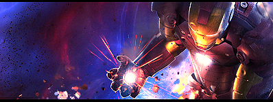
Huge image. Banner for an old site I was part of.

CnC me, pl0x O:
 

Attachments

  • k2g5g7.png
    k2g5g7.png
    78.6 KB · Views: 247
  • u6g6b.png
    u6g6b.png
    89.5 KB · Views: 252
  • 2clg2d.png
    2clg2d.png
    90.2 KB · Views: 254
  • bhglz4.png
    bhglz4.png
    96.5 KB · Views: 270
  • 2gy1qwh.png
    2gy1qwh.png
    114.1 KB · Views: 253
  • 34s5ydz.png
    34s5ydz.png
    123.7 KB · Views: 256
Last edited:
You're really good at backgrounds!
I like your ironman one most, i think the only thing you could improve on is maybe not having so much blank space (like the left side of the ironman sig) otherwise theyre awesome!
 
The space you leave is one critique I have, but otherwise the sigs you make are really really good, they all just seem to pop out.
 
I will have to agree with Nero. You have quite a few signatures with some emty spaces in them, but I must say I really, really like your style. It's very clean, vibrant, and the placement is spot on I think. Love your text. Very refreshing style! :D Keep posting them!
 
Thank you! O: And yeah, I have some negative space problems xP I like open spaces on my sigs for some reason, so I usually just leave one part or another blank. The Iron Man one was supposed to look like this:

c6gxk.png


I thought there was a lot going on, so I changed it up xD
 
That second Ironman one is much better than the one in yer first post. :) It has less of that emptiness in it, but at the same time it still creates a lot of space. My favourite sig, though, is yer Daftpunk one! The empty space doesn't bother me so much, and I really like the way it looks like you're looking at their reflection in water.

But, I do very much like all of these. Although I do find the Vanitas sig to be a tad too cluttered. But that could be just me. :hmmm:

Good job! :monster:
 
Definitely not just you. The Vanitas one is my oldest one of the lot, and before I got better. Super cluttered and messy. I've been trying to fix it in my more recent works, but I guess I might be over doing it! Thanks for the feedback O:
 
new tag i made for a request by a friend

14dg9ko.png


not too fond of it :/
 
Ahahahaha. Hey KsX xDDD How've you been?! Haven't seen you in ages :3
 
Hahaha, indeed xP Hard to believe we met like 5 years ago on an online RPG game
 
Hey guys, keep in mind it's a post count section graphics related. Feel free to take your personal conversations to the GFX Lounge's Chit Chat, or VM's! :D
 
That's awesome man, I made a planet manipulation ages ago and it's really fun to do :lew: I remember I made the planet surface by using a rust texture.

I really like your sigs. Just my opinion, but forget what people say about the empty space, I don't think the space looks empty on the Ironman sig. I love it. It's so easy to get into a pattern with sigs because tutorials say what you SHOULD do rather than what you want to do. Fuck them, make your own style. Who says you need to make it less empty or have this and that? Do what you want.

Keep posting. (y)
 
I completely agree with Oxides statement about disregarding what people think about the empty space. Not a single one of your sigs looks empty to me either. I do think the Iron man could be placed better but by no means do i think it feels empty. I like your style and particularly the tags in which you use massive text. I like to do that aswell. The planet looks fantastic. Youv actually made it look round and not flat which is the hardest part of it all.
Id like to see you make some bigger sigs just to see what the outcome is. You seem to have your size preference down but its good to be taken out your comfort zone sometimes and try something different.
It stops GFX becoming boring, at least it does for me, and i dont mean boring for me to look at your sigs i mean it becomes boring when making them. You have a cool style and id like to see what you do with a bigger canvas sig =)
 
Thanks for the feedback, guys! I really appreciate it :D I usually do like working on larger canvases, I end up cropping them or resizing them as I see fit, though. I'm just very traditional when it comes to the size I like for my tags xP

Here's something a little larger for you guys, though; http://i45.tinypic.com/23k42s1.png
 
Back
Top