Birth of a Mascot -- Watch me create anime/manga characters for my original visual novel engine!

But... why they have no shirts now? :P Unless I'm missing something, they're missing shirt collars, lol.

Anyway, great work, excited to see what happens when you start coloring.
 
But... why they have no shirts now? :P

Yeah, this is part of what I meant by it needs color to make visual sense :P The idea is for them to be wearing dark gray body suits (not sure if that's the correct term) which go all the way up the neck. The rest of the outfit will be largely white, so I'm going for a sort of high-contrast look, if that makes sense.
 
Well, today went better/faster than expected! I do believe Mei is basically finalized:

mei-day7.png

My only real concern is the size of the left arm. Technically it is proportionate to the right arm (I measured), but it feels just a bit small IMO. Rules and measurements are great and all, but at the end of the day I prefer to adjust for how a thing actually feels, so we'll see. Could also just be that I've been staring at it and tweaking too long. I've lost track, but I'm probably somewhere around 30 hours for this project by now :P

On the bright side, it's not far off now! Next step will be going over everything in pen, and after that, the part I'm really excited for: coloring! Stay tuned! (y)
 
Wow, Mei looks really cool! I think her anatomy is perfect as well! :D I'm so jealous, my anatomy sucks, but every part of Mei is so cool!;3; I think her arm's size is totally fine, you shouldn't worry about it. I can't wait to see her colored!C:
 
Thanks for the feedback guys, the arm is staying as-is then :)

I think her anatomy is perfect as well! :D I'm so jealous, my anatomy sucks

One word: references. References everywhere :P
 
Whew, well this took longer than expected. I think perhaps I ought to revisit my inking technique, because last time I inked a character it only took me one day, not four! Oh well.

At any rate (slow, in this case), here they are:

miki-day8.pngmei-day8.png

At long last, I'm done messing with lines! There's still some things that could be better, but both characters have reached a point where I'm happy with how they look, and I'm pretty sure no one else will judge their faults as harshly as I will.

A few little things did get changed from the rough drawings (like the angle of the feet, for instance) but the big deal here is that both drawings are now completely vectors! Not only does this mean they're nice and clean, but I can render them at any resolution and easily make adjustments to things like line width without redrawing anything. In fact, being able to so easily edit lines was part of what took me so long--every time I noticed some imperfection, I couldn't help myself correcting it :P

While there's still work to be done, I feel I can now breathe a sigh of relief. No matter what happens from here, I have two complete characters! Yay!:cheer:

Next stop: color!

Until next time!
 
If I may make a suggestion (a very light one mind you), maybe try messing with the outlines, making them just a bit thicker than the rest of the lines. Being vector lineart, the line weight is really flat here. That's not a bad thing, but varying line weight gives a lot of character, and some decent depth. It also plays with coloring a little better. But rather than going line by line and trying to do it that way, or redoing the lineart as a whole, simply making the outermost 'silhouette' lines slightly thicker might add some of that character.

I'll send an example to you
 
Thanks for the suggestion, I'll definitely look into that. As a matter of fact I had debated about the line thickness but I didn't want to overdo it. Still, since these are vectors, modifying the thickness of the lines is really easy. Manga Studio FTW!
 
miki-day9.pngmei-day9.png

Aaaaaaand color!

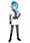
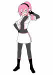
At last everyone can see what I was going for with the outfits and why they didn't make sense with lines alone! Of course there's still a bit of color work to be done since the dark sections will need their lines adjusted to a lighter color to compensate, but on the whole I think I'm satisfied with this scheme. I considered making the boots and gloves white as well which definitely did give off a very bright look that would be appropriate for a stage outfit, but overall I think the black makes things much more visually appealing. Another option I'm considering is coloring them with each character's accent color which may look nice as well, but I don't want to overdo the accent.

In any case, things are really starting to come together now!
 
looks so good so far! loved the colors :D you going with cell shading or over painting? can't wait to see the final results (omg can I have your permission to paint the lineart? I rarely color digitally and would love to try it!)
 
shivas Cel shading :)

And sure, I don't mind if you practice coloring on my characters. I'd love to see the results, in fact! Only thing I'd ask is not to post your work on sites like DA or Imgur, etc. until I've published the new version of my VN engine which will use these characters in the demo. Before then I'd like to keep things pretty controlled, but once they're out in public for real anything noncommercial is fine with me.
 
Well this is hardly complete, but it's a big enough step forward that I feel it's worth posting:

miki-day10.png

Miki now has rough shading and highlighting as well as a few gradients to smooth out the colors and give life to the eyes. At a distance it somewhat resembles a finished product at this point, but up close there's still much work to be done. Shading isn't something I really feel I have a good grasp on yet, so critiques are welcome.

Thankfully, once all this is done most of it will copy/paste over to Mei nicely. As such I haven't done anything else with her yet, but you'll see her again soon!
 
miki-day11.pngmei-day11.png

At long last, they're finally here: Miki and Mei Tokimiya are now complete! :cheer:

When I first started this project I had no idea it would take this long to finish, but I have no regrets whatsoever. This has been a tremendous learning experience in a field that I will be spending much more time in very soon and that I'm sure I'll come back to over and over again as my projects demand.

But wait, there's more!

As these are visual novel assets, there is still one final step to be completed: facial animation! This will be quite the gear shift as I'll move from Manga Studio into After Effects and do the rest of the work completely digitally. * Insert sigh of relief here *

Until next time!
 
Nice job! Pretty professional looking overall. The gradients really make the biggest difference if you ask me. Really works well.
 
They look really gorgous!:D I like the way you colored them, they really look like professional works!>3<

I can't wait to see them having facial animation!:3
 
Well, I suppose it's about time for another update!

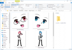
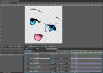
As teased before, lately work has been all in Adobe After Effects as opposed to Manga Studio, getting the characters' facial animations ready for exporting into a visual novel. Fun fact: visual novel characters are drawn in two parts: a body with a blank face, and a face with a blank background. This saves a LOT of potentially wasted memory and makes it very easy to create new expressions. Thus, step 1 was creating separate renders for Miki's and Mei's bodies and faces, like so:

split-render.png

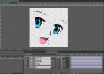
Bodies were rendered at 5K resolution and faces at 0.5K--large enough to suit pretty much any purpose. But of course, at this point we only have one frame for each face. That's where After Effects comes in. While you could of course draw individual face frames by hand, After Effects being my specialty I prefer to create a digital facial rig instead. In the past I've created very advanced faces that are fully posable down to eye dilation and synchronize with other facial elements via simple programming techniques--a bit more advanced than this drawing really calls for though, so instead I simply divided the face into the individual components I'd need.

split-face.png

With the facial elements divided up, animating them is just a matter of keyframing the position, rotation, and scale, and adjusting the mask to hide any unwanted bits, if necessary.

sprite-animation.png

...Or at least, it would've been that simple if not for one thing: the mouth. Anime can get by with lots of unnatural animations, but everything has its limits. Unfortunately there's no way to animate a static image of the mouth and get any sort of acceptable result, so I had to digitally reconstruct it. This involved creating a layer with a handful of colored circles matched to the colors of the hand-drawn mouth and an alpha mask to hide everything outside where I wanted the lips to be. The alpha mask also doubles as the lips themselves, which are now fully posable. Without it, this is what the digital mouth would look like:

sprite-mouth.png

Terrifying, no?

At this point I can now animate the lips however I want to, and the mouth inside won't be stretched--it'll stay in place/scale while the lips animate, as a mouth should do.

sprite-animation-mouth.png

Put it all together, and this is the result:

51sgKaS.gif


Each expression has two states: one where the character is talking (such as above) and one where they are not (same animation minus the mouth movements). Once they're all done, I'll downscale and render them out as PNG sequences which can be imported into Edge VN and drawn as real visual novel characters!

And...that about does it! Next time you see Miki and Mei, they'll be in-engine promoting the great big version 2.0! Excuse me while I get back to writing code...

Thanks for following this project, guys!
 
That's really cool, and seems a damn sight more flexible and easy than the way I animate things... by hand, frame by frame. Then again, I only dabble in animation. But the point is, this looks really good!
 
Back
Top