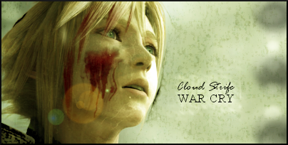
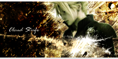
I like the Zack Fair one more than the Sora siggy. The background looks nice and interesting, the render isn't too shabby at all. I think if you used a colour balance gradient, and make the colours match a bit more it'd look like a great signature. Maybe resize Zack to a bit smaller size.
I'd say go for an all capitals under line, and have the cursive text resting on top of it, but just barely.")
I'd say go for an all capitals under line, and have the cursive text resting on top of it, but just barely.


")


 but didn't really know how to tweak it.
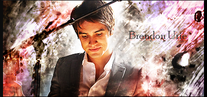

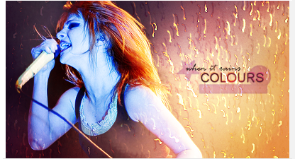


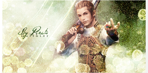


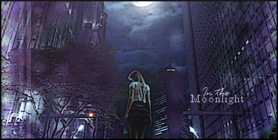
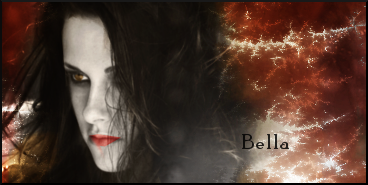
 Like you already said, the lighting is a bit off, so I don't need to say anything about that, really. The colours match nicely, pretty nice effects on the left, and the sparkles look great.

