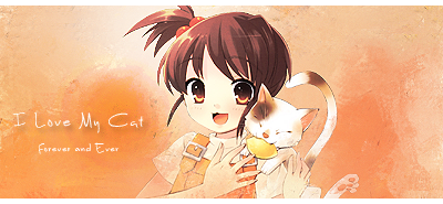
Stevie's Graphics

Status
Not open for further replies.

Steve-O

England's Answer to A Epic Wheelchair Driving Arml
Veteran
Joined
Feb 25, 2010
Messages
3,732
Age
30
Location
Southend, UK
Gil
0
FFXIV
Yuno Mizuno
FFXIV Server
Lich
Free Company
Silver Lining
Time for a new GFX Thread... I got the old one closed because i had it for 5 months and it was getting too packed :hmph:

Anyhow I been working with Graphics for about 6 months now. I use photoshop CS3 and comments and links to tutorials are always helpful :grin: I may take requests this time around :wacky: please feel free to give me a PM or adding a post here if u want a request done :)

anyway.. here are my newest works :)
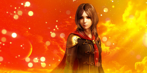
RemSig.png


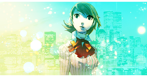
Blending1.png


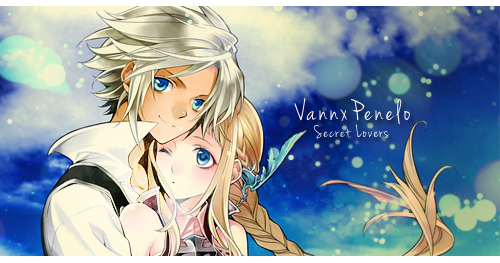
VannxPenelo.png


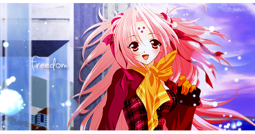
Freedom.png


utf-8BTWlrdVNpZzIucG5n.png


Vector.png


ILovemyCat.png


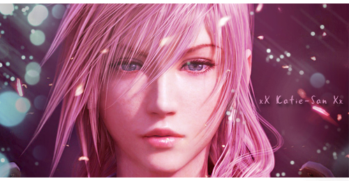
katielightningsigrequest2.png


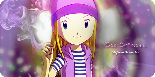
ZoeDigimon.png


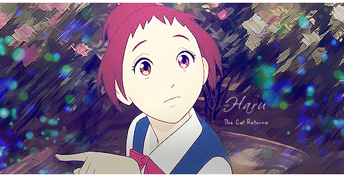
HaruSignature.png

As always comments are always helpful :grin:
 
Last edited:
SOTW 210 Entry :wacky:

SOTW210.png


i got 4 votes... that a start :wacky:
 
Oh, I thought your entry was gorgeous, too! :) Loved the colours and simple effects.
 
Oh, I thought your entry was gorgeous, too! :) Loved the colours and simple effects.

haha thanks :grin: was beaten by a truly awesome signature :)
 
here a sig i made tonight :grin:

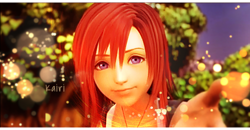
KairiSig2.png


the image used is the same one as the one used in my current sig (it was made by lou) soo this is kinda my the way i used this image :grin:

EDIT: Made a little Kairi tag :ryan:

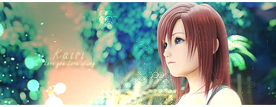
KairiTag.png
 
Last edited:
Just dropping this by :grin:

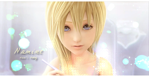
NamineSig3.png


now u may carry on with ur lives :ryan:
 
Update time :grin:

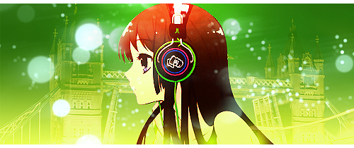
AnimeHeadphones.png


made this this morning :P quiet like it.. couldn't be asked adding text :)
 
Great job :)

My favorite is the vaan and Penelo sig. Background, lighting and the render are good. The other sigs are cool too. I am not that good in GFX but my advice is to add more variety to your works. Try something new ;)
 
Great job :)

My favorite is the vaan and Penelo sig. Background, lighting and the render are good. The other sigs are cool too. I am not that good in GFX but my advice is to add more variety to your works. Try something new ;)

yh that my next step :)

oh yh... need to reply to something on ur thread XD
 
Yuna sig

YunaDissidia.png


not to happy with it.. went crazy with the textures and i think it has no flow.. one of my fail sigs XD
 
Update time :grin:

AnimeHeadphones.png


made this this morning :P quiet like it.. couldn't be asked adding text :)
It's nice, but I suggest use a really small soft brush eraser over the outline of the render :gasp: The render has some white lines around it that really stick out and makes it look less blended in >_<
 
It's nice, but I suggest use a really small soft brush eraser over the outline of the render :gasp: The render has some white lines around it that really stick out and makes it look less blended in >_<
haha lool i really didn't notice that XD lool i would of have if i seen them :ryan:
 
I'm on a roll today... mmmm sausage roll :P

anyway two signatures

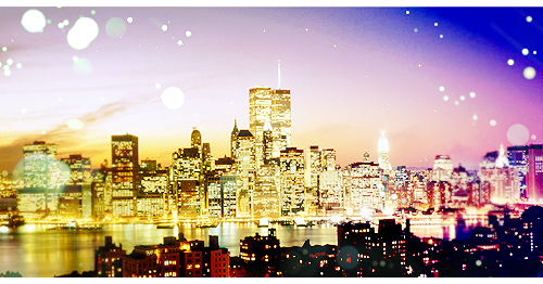
Sunset.png


this one I like... lighting decent... and i decided for once that it was better without text XD

the second one has an avatar as well (I did try and make the avatar different)

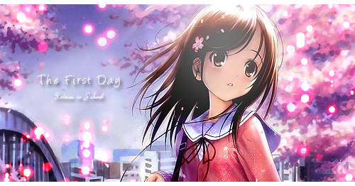
Schoolavatar.png


School.png


for once.. I like my text that i used.. took me half an hour to pick the right one :hmph:
 
School.png
of8DK++rT1TlNIoAAAAASUVORK5CYII=


This is reaaaally pretty! :inlove:

The lighting is nicely done, and the stock is cute, but as much as you like the text I can barely read the bottom line, it's also a nice tip to seperate the letters a bit and put the text closer together, it looks neater that way sometimes.

But other than that, I love it! Well jealous! :gasp:

:gasp: thanks for the comments lou :inlove: text is always where I fail... but oh well.... and thanks on the lighting.. i did something different than what i normally do.. rather than changing the layer option to overlay i just turnt down the opacity level :ryan:
 
RemSig.png


This is rather pretty, but it looks really empty. Just having the character and no text or additional effects to fill it up leaves it looking blank and unfinished. That said, I love the flow and choices of colors. They match Rem nicely and with a bit added, I'd really like this sig.

Blending1.png


This is really pretty and well blended for the most part. She looks a little sharp in a few spots, but the lighting is nice and I like the dots in this one much more than the previous. Again, text would be a nice addition, but I'm not sure where it would fit... maybe above her right (your left) shoulder. Overall, I really like it. The background is just gorgeous looking, I'm a sucker for cityscapes.

VannxPenelo.png


Awww that art is adorable. I think the cloudy background just adds to the cuteness, and while they're not very blended in with it, it's still cute. I'm not so sure about the text, since it's somewhat floating in the air which I would advise against. The end of her braid also looks a bit odd, I probably would've edited it out myself. I'm not sure the dots are doing it here either, and I think you should find some different textures/effects/C4Ds to use too. XD

Freedom.png


She stands out from the background really brightly here, but that might've been the intention. I think the blue and purple background doesn't quite fit the orange/red/pink she's wearing, but taht's just me being picky. I think I'd like to see you do a lot more to your sigs, since some of them look a bit plain so far. The text could be moved a little closer, and it'd be nice if you tried a color other than white.

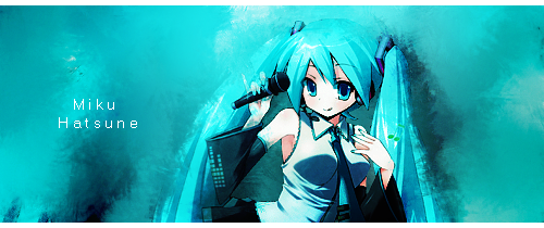
utf-8BTWlrdVNpZzIucG5n.png


The blending in this one is just... wow. It looks quite nice for that part. I think Miku herself is overcontrasted though, and it takes away from the signature as a whole. I think the bright parts of her hair might also blend better with a lower contrast. The text is boring compared to the rest as well, and way too far away from her. =[

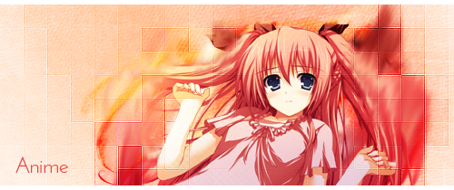
AnimeGirl.png


I absolutely adore those squares, I think I've commented on this one before. The only complaint I have about this one is the text, but I'm willing to overlook it because I like the rest of it so much. XD

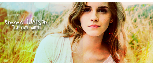
EmmaWatsonSig4.png


Hermione. <3 I think the biggest problem here is... if you look just to the right of the center of the signature, you can see a line of color. There's a texture or something on her face and it's discoloring part of her but not the rest. The red flashes in her hair and on her neck/face are also distracting, and without those, I think I would like this a lot more. The font for this fits the quote, though, being picky me, I'd move it over. Haven't heard that from me yet, have you?

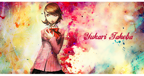
PersonaSig.png


OH MY GOD THE TEXT ISN'T WHITE. yessssss. <3 I really like the grungy overall feel of this, but I feel that it's also a bit too empty. With a canvas like this, I'd probably duplicate my favorite technique and use her image twice, one large and one small... though it seems that I'm the only big fan of that on this site. =[ Sucks to be me. That said, the colors on this are really pretty and it reminds me of splatter paint. The text is kinda floating but... there's also nothing to "anchor" it to either.

SOTW210.png


.. it's that picture! The one from the first Yukari sig. I think the blue in the corner is a bit too strong, since it keeps catching my eye, but other than that, this is really pretty. I don't remember if I voted, but this would've been close to my heart if I did.

KairiSig2.png


There you go with those dots again. XD They work here though. I'd be careful about getting textures/effects on your character's face, but other than that, I like the swoop under her face. I'm usually iffy about putting things on characters' necks either, but this looks nice. The text is subdued for such a bright sig, but it doesn't take away from the whole either. Probably my favorite or second favorite so far. <3

KairiTag.png


I love that image, and the coloring you've used on it is Nice too. Muted and subdued. <3 Be careful about the textures on characters again, and the text is floating alone again, but this is sad looking and cute. Very pretty.

NamineSig3.png


I'm going to break into your house, get on your computer, and delete those dots. That said, Namine. <3 The dot-stuff over her chest looks.. really weird, though. with a picture like this, I'd put effects around her and work on the coloring more than putting things ON her. The text also looks odd, but I think it's the spacing in that font. The lower text is having the same problem, and it's a bit too far away from the first text.

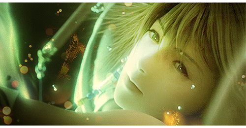
YunaDissidia.png


This looks like a hard image to use, I rarely use just faces. I'd keep the effects off her face, again, other than lighting and coloring. IF you put some more time in this, I think it would be fine.. though the picture seems a little low quality. It just looks unfinished overall.

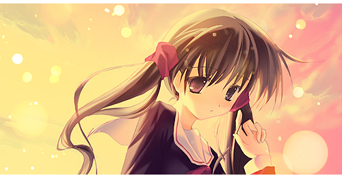
Sunset.png


The coloring in this is just beautiful, and it's very simple. <3 I don't have anything to pick at really, it's quite nice as it is.

School.png


MORE DOTS. again, be careful with the stuff over the character, it tends to take away rather than add. And I'm... not agreeing on the text. It's sorta floating again, and the lower font is really hard to read. As a rule of thumb, I use one fancy font and one simpler one in my sigs. The colors of the trees and the girl look quite nice though. :3

Overall, download some more fonts and vary your text some. Maybe get some effects that aren't those dots, or explore your filter options some more. Sometimes you can make really pretty things just with stocks that are duplicated. Checking out some tutorials for techniques and text wouldn't hurt either.

I'll be baaaaaaack~

Edit: and borders that aren't white/half would be a nice change as well. : D
 

These two are both really pretty!

I love the soft mellow colours in the first one. The simplicity of it is appealing and I love the half border. <3

The second one is so vibrant and colourful.

Such a gorgeous image and the text sits so nicely in that space. Very cute and pretty signature!

Awesome work!
 
Thank you :) the thing i need to do is not to use the same resourcs and effects over and over again.... Lool it must get boring for you guys XD but thnks for the comments guys and yh ill look for other resources that i could use other than dots :p
 
Just a quik update... No signatures... But i got CS5 on my macbook yesterday soo gonna make a few signatures to try it out.. Im also gonna add all my work on the first post later.... I already put all the images in my first pst within a spoiler tag :grin:

Also Sexy Beast thanks for the comments XD i lie warm colours :inlove:
 
Status
Not open for further replies.
Back
Top