- Joined
- Dec 14, 2006
- Messages
- 11,628
- Location
- California
- Gil
- 0


- FFXIV
- Mitsuki Calei
- FFXIV Server
- Lamia
- Free Company
- Gaia
Constructive criticisms, at that.
I'm sure the majority of us have looked back at our own tag from the past and thought that we could have applied something different to make the piece more preferable. Often times we'll showcase our tags and receive CnC from our fellow GFX artists, and although some of them raise a valid point, there are also times that we'll disagree because we created the piece so we know the kind of style we want. And not everyone will agree to a certain style. So here's a thread for us to actually do that: give constructive criticisms to our own work and say it how it really is. As they say, you are your own best critic, so this will give us a chance to really be honest with our production and analyze the tag as a whole, without the fear of being overly too harsh or judgmental of other's work.
Do make sure you point out both pros and cons; if applicable. And please do not give input on other's work (as they will be deleted). This thread is strictly for artists to show they CnC skills toward their own.
I'll start this off.

Onion Knight tag. One of my favorite work, but there are also a few flaws in my eyes. First, I'll state the reason why I'm proud of this tag. There are only a few people who've noticed that Kefka is in the background. I've tried to manipulate and really blend this with the main look as possibly as I could. Reasons? I guess for perception-related reasons, and maybe show a bit of 'clever' skills on my part. When I do work, I also would like the viewers to see exactly what I was trying to accomplish behind-the-scenes. Whether I was successful or not, depends on the viewer.
Now, I wish I could have taken out that 'Kefka' text behind 'Onion Knight'. Looking at it again, it seems so out of place and sorta throws that area off. Along with that, I thought the overall look seems a tad bit messy. Admittedly I was kind of going for that style in order to piece the whole 'clever perception' theme together, but something went wrong along the way. Maybe it's the tiny red speckles here and there that I am noticing, along with the dark speckled-ones thrown in on the mix. It's something minor, really, but when I start to really study it, I can't help but feel that either the work was incorporated in an untidy manner or it was too overdone. But all in all, like I stated earlier, it is still one of my favorite work.
I'm sure the majority of us have looked back at our own tag from the past and thought that we could have applied something different to make the piece more preferable. Often times we'll showcase our tags and receive CnC from our fellow GFX artists, and although some of them raise a valid point, there are also times that we'll disagree because we created the piece so we know the kind of style we want. And not everyone will agree to a certain style. So here's a thread for us to actually do that: give constructive criticisms to our own work and say it how it really is. As they say, you are your own best critic, so this will give us a chance to really be honest with our production and analyze the tag as a whole, without the fear of being overly too harsh or judgmental of other's work.
Do make sure you point out both pros and cons; if applicable. And please do not give input on other's work (as they will be deleted). This thread is strictly for artists to show they CnC skills toward their own.
I'll start this off.
Onion Knight tag. One of my favorite work, but there are also a few flaws in my eyes. First, I'll state the reason why I'm proud of this tag. There are only a few people who've noticed that Kefka is in the background. I've tried to manipulate and really blend this with the main look as possibly as I could. Reasons? I guess for perception-related reasons, and maybe show a bit of 'clever' skills on my part. When I do work, I also would like the viewers to see exactly what I was trying to accomplish behind-the-scenes. Whether I was successful or not, depends on the viewer.
Now, I wish I could have taken out that 'Kefka' text behind 'Onion Knight'. Looking at it again, it seems so out of place and sorta throws that area off. Along with that, I thought the overall look seems a tad bit messy. Admittedly I was kind of going for that style in order to piece the whole 'clever perception' theme together, but something went wrong along the way. Maybe it's the tiny red speckles here and there that I am noticing, along with the dark speckled-ones thrown in on the mix. It's something minor, really, but when I start to really study it, I can't help but feel that either the work was incorporated in an untidy manner or it was too overdone. But all in all, like I stated earlier, it is still one of my favorite work.
Last edited:


 This is one of those tags i dont care what anyone else thinks of as i love it.
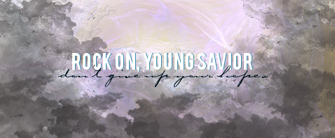

 *Searches through old signatures 'cause she hasn't really been productive lately.* Aha!


")

